Temperature Trend in the Wadden Sea 1:
Annual and Monthly Mean Values
ScenarioLike every year towards the end of winter, my family makes plans on where and how to spend the coming summer holidays. Mom wants to go hiking in the mountains, my sister wants to spend the holidays by the sea, and my dad will probably feel happiest in his garten at home. Last year, we spent some rainy holidays at the Baltic Sea and that spoilt dad's mood for summer holidays altogether. As for me, I'd really love to go swimming in the sea. Lately, I've heard that the North Sea is becoming warmer and warmer, apparently due to the global warming. Could this be true? While surfing in the internet, I stumbled upon temperature data about the North Sea measured at Spiekeroog by the University of Oldenburg. The measurements are mean temperatures for each month. But knowing that it's hot in summer and cold in winter, the data show very strong fluctuations. So you can't really tell from these data, whether it's really getting warmer or not. Well, I guess I'd better take a closer look at it! I downloaded the data and saved it here. They begin in October 2002 and last until March 2009. The columns indicate the year, the month of the year, air and water temperature and the salinity of the water, all measured at Spiekeroog. |
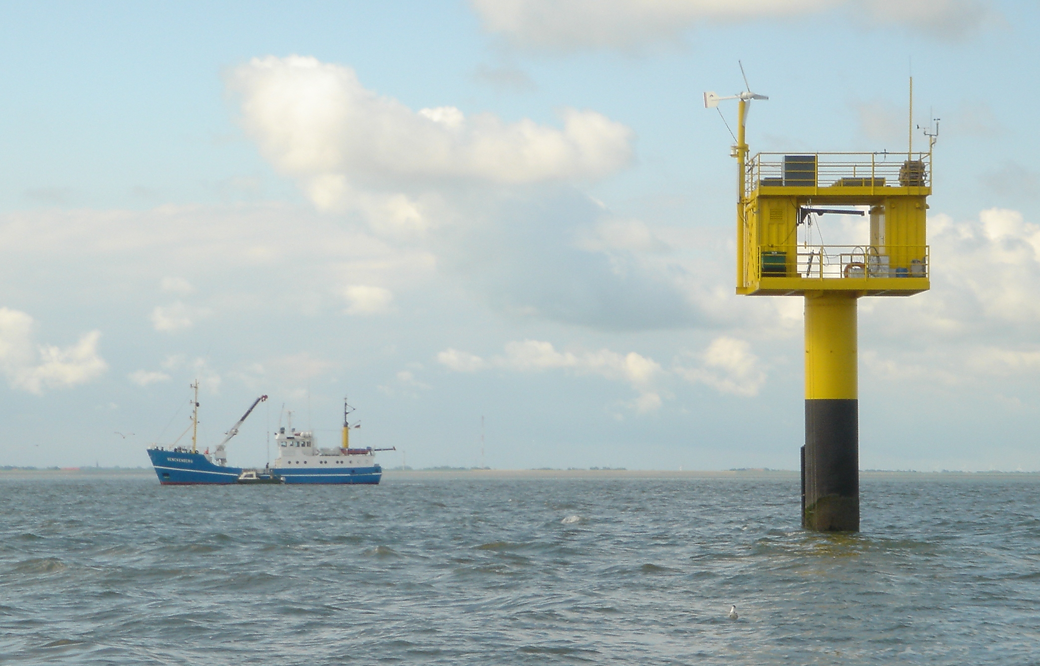
Monitoring station of the University of Oldenburg at Spiekeroog in the Wadden Sea. On the left hand side, the research ship Senckenberg.
|
Questions
We want to find out, whether the air temperatures and - more importantly for swimming - the water temperatures have increased
since the end of 2002 to early 2009.
- Contemplate on how you can compute the yearly mean temperatures out of the
monthly mean temperatures.
Draw a diagram showing the computed mean temperatures as points over the time axis indicating the years from
2003 to 2008. Draw a straight line somewhere between the points, keeping the distance between the points and the
straight line as small as possible. Can you see a trend to higher temperatures?
- Suppose the yearly mean temperatures are probably not very interesting for us because we go to the North Sea every year and so we
only want to know the temperatures in July. Draw a new diagram showing the temperatures in July for each year and then
proceed drawing a straight line between the points. Can you see now whether it has become warmer in July over the years?
- How about the temperatures in January, in April and in October? Draw a diagram for these time series, too.
How do you assess the results?
- When it rains, rainwater dilutes the sea water thus reducing its salinity. Compute the yearly mean salinity levels and
translate the results into a diagram like in Question 1. Indicate the values for January, April, July and October, as well.
For the vertical axis, choose a value margin for salinity levels that will use up as much space on the paper
as possible and should be able to show a trend, if there is any.
By the way, in the Internet you can also find up-to-date data taken at Spiekeroog; it's a big help when planning your summer holidays!
Materials needed
- The worksheet as printable rtf-file
- Chapter 2: Working with Time Series, Measurements in the Wadden Sea
