Measurements in the Wadden Sea (2/3)
We have seen on the previous page that the course of air and water temperatures and seawater salinity yields time series
which appear rather independent of each other when viewed over a few days time. The observed short-term fluctuations become
less relevant if data sets covering several years time are considered.
Data covering several years
The graph below shows the time series of temperature and salinity for the period of October 2002, when the Spiekeroog
time series station was put into operation, until March 2009.
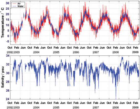
Time series of air (red curve) and seawater temperature (blue curve) and seawater salinity measured between October 2002 and
March 2009. Marks at the time axis depict 1st of April and 1st of October of the year.
Data shown in the graph above were taken in 10 minutes intervals, and the graphs show all data which have been checked for accurateness
with control measurements. The accuracy is ±0.1°C and ±0.01°C for air and seawater temperature, and ±0.2 psu
for salinty. Gaps in the time series are due to failure of sensors or station computer.
At first glance, what do you think of this time series?
Obviously, it gives evidence that it is hot in summer and cold
in winter; certainly not a big surprise! But air and water temperature curves are almost identical, this is probably
not so clear beforehand. The salinity curve looks rather irregular over the years.
Questions: Time series over several years ↓ ↑
-
Air and seawater temperatures almost coincide and show a seasonal cycle. When considering the information given on the Wadden Sea
on the previous page, what is the reason that both temperatures, plotted over extended times, look almost the same? Would you expect
that this holds in the open North Sea as well, where the water is 30 m deep or more?
-
On closer examination the air temperature appears stronger fluctuating at shorter periods than the water temperature.
What causes this more pronounced short-term fluctuation of the air temperature?
-
Surprisingly enough, seawater salinity does not show a seasonal cycle. Which phenomena in coastal waters like the tidal flats cause
a) an increasing salinity
b) a decreasing salinity?
To which extent are these phenomena connected to the seasons of the year? If so, can you find periods in the time series
where salinity variations support your hypotheses?
Monthly averaged data covering several years
We are interested in an analysis of the time series data shown in the left column, to investigate if air and water temperatures
are significantly changing over the years. For this purpose and with the aim to remove the short-term fluctuations shown on the previous page,
the data set has been averaged over each calender month.
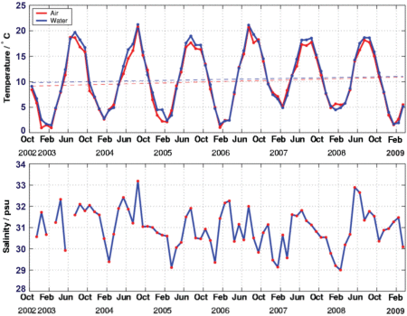
Monthly averaged time series data of air (red curve) and seawater temperature (blue curve) and salinity measured between October 2002 and
March 2009. Marks at the time axis depict 1st of February, 1st of June and 1st of October of the year.
At times of global warming we are curious to find out if a trend of rising temperatures can be made out in the data set.
For this purpose, best fit straight lines were calculated for air and seawater temperature data in the period of October 2002 to
March 2009 and plotted in the diagram (broken lines, blue: air temperature, red: water temperature). The regression lines depict
an apparent temperature rise of 1.75°C in air and 1.22°C in water! This corresponds to 0.27°C and 0.19°C per year,
respectively. Extremely high, in view of the global mean temperature rise of approx. 0.8°C between 1880 and 2007, as reported
by the Intergovernmental Panel of Climate Change (IPCC)!
Questions: Varying temperatures ↓ ↑
-
At first glance the seasonal pattern of air and seawater temperature suggests rising temperatures over the period of observation.
Please have a look at the annual maximum and minimum temperatures and check for variations from previous and coming years.
Can you identify particularly hot or cold summer or winter temperatures?
-
What linear regressions lines do you expect for the period of October 2002 to September 2006? And October 2006
to September 2008? Do they suggest the same trend of rising temperatures as the lines shown in the graph above? You can perform your own calculations
with numerical data available on a worksheet, see the link at the end of this page.
-
The regression lines shown in the graph were derived for the entire data set between October 2002 and March 2008. Find an argument to say
that this procedure not correct; instead, it would be correct to calculate a regression line for the period of October 2002
to September 2009, i.e., for a number of entire years.
Curious enough, when doing so, i.e., removing the October 2008 to March 2009 data, we find an even stronger trend of rising temperatures. Why is this so?
We see that it is not so easy to identify trends of climate change!
Related SEOS link


